[Campus Safety, Analytics]
Illini Safe
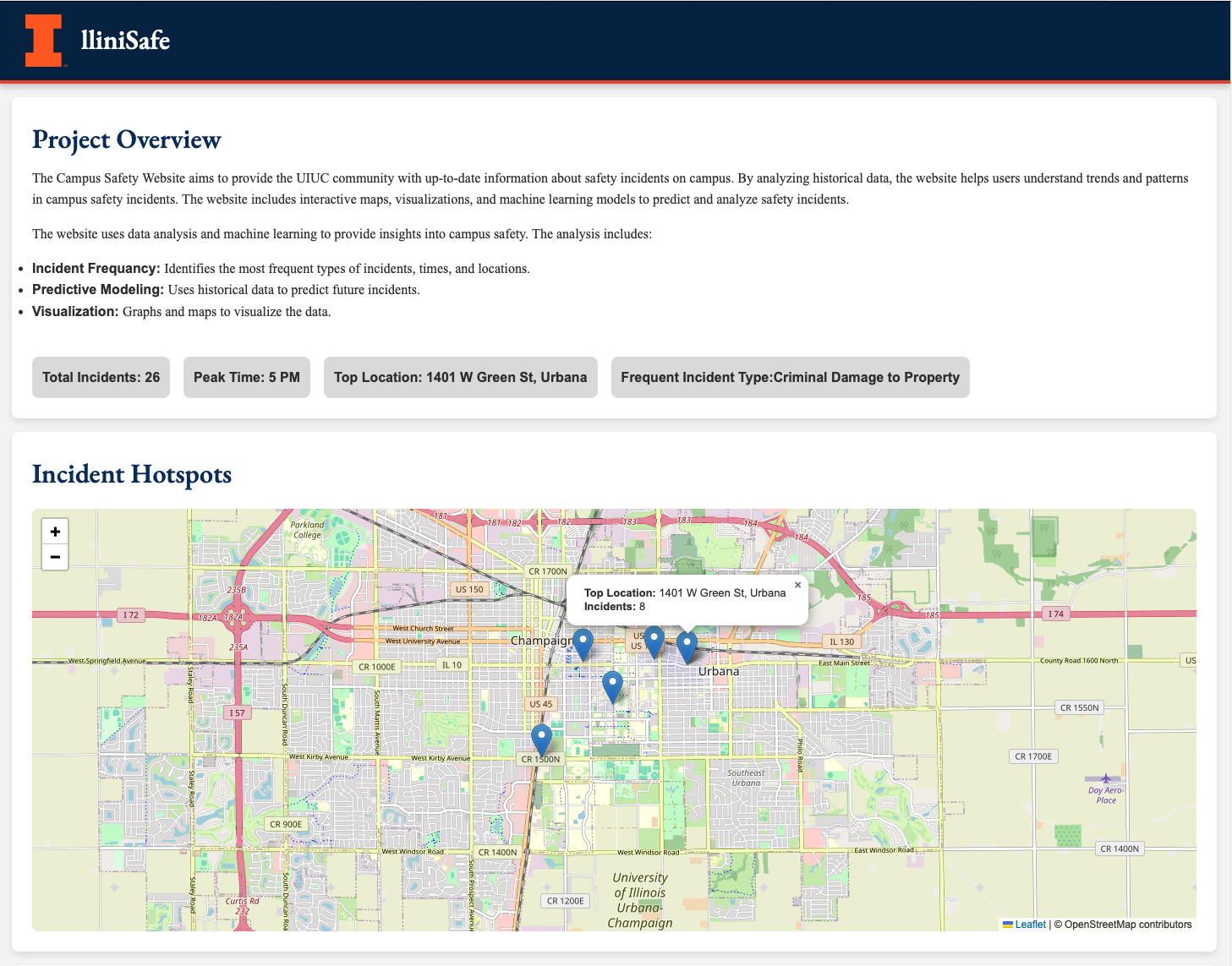
The Illini Safe website provides up-to-date information about safety incidents on campus. Through historical data analysis, it helps users understand trends and patterns. The platform features interactive maps, visualizations, and machine learning models for predicting and analyzing safety incidents.
Data Analysis / Visualization / Product Design / Dashboards
Data is grouped by location, time, and category, with filters that never hide critical context. The interface uses restrained color and typography for clarity and to reduce cognitive load during emergencies.
- Interactive maps to visualize safety incidents on campus
- Charts and graphs to illustrate trends over time
- Predictive analytics to flag potential risks from historical data
- Easy navigation and access to information for all users
- Frontend: HTML, CSS, JavaScript
- Backend: Python
Hover and focus states emphasize exact values without overwhelming the layout. Alerts stay anchored and scoped to roles, while timelines animate subtly to show change over time.