Snapdrum · snapdrum.com
What happens when an AI company's website finally reflects the intelligence of its product?
Core Concept
A full redesign converting a static marketing site into a dynamic enterprise experience, raising the bar on interactivity, accessibility, and modern design standards.
Role
Frontend Developer
Product Designer
Duration
Jan 2026 to Apr 2026
Scope
Frontend
Product
UX Design
Live
snapdrum.com
The Context
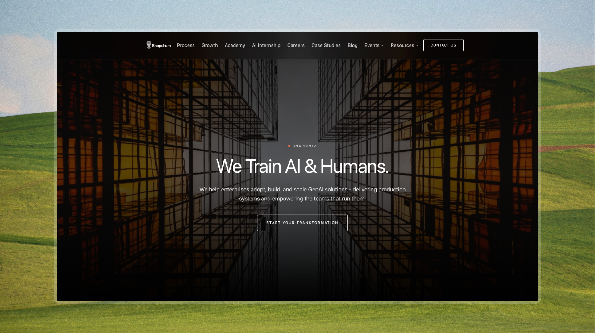
Snapdrum trains AI & humans. Their old site didn't keep up.
Snapdrum helps enterprises adopt, build, and scale GenAI solutions, delivering production systems and empowering the teams that run them. Their audience spans developers, product teams, and enterprise decision-makers who expect credibility and polish at first glance. The previous site was static, dense with information, and visually underwhelming, failing to convey the sophistication of the product behind it.
The Problems
Four things were holding the site back.
Problem #1
Static and lifeless. Nothing to keep users engaged.
No animations, transitions, or interactive elements meant visitors experienced a flat, passive site. For a company building cutting-edge GenAI solutions, the experience communicated nothing about the energy or sophistication of the product.
Problem #2
Too much information, no clear hierarchy.
Dense blocks of copy with no visual breathing room made it hard for developers, product teams, and enterprise buyers to quickly understand Snapdrum's value. In enterprise sales, clarity is credibility. The old site had neither.
Problem #3
Plain design that didn't earn trust.
No visual evidence, weak social proof, and a generic aesthetic failed to signal enterprise-grade quality. For buyers evaluating an AI partner, the site offered no reason to believe Snapdrum was the right choice.
Problem #4
Accessibility and modern standards were overlooked.
The existing site was built without accessibility considerations or modern frontend standards, limiting its reach and leaving technical visitors, developers and product teams, with a poor first impression.
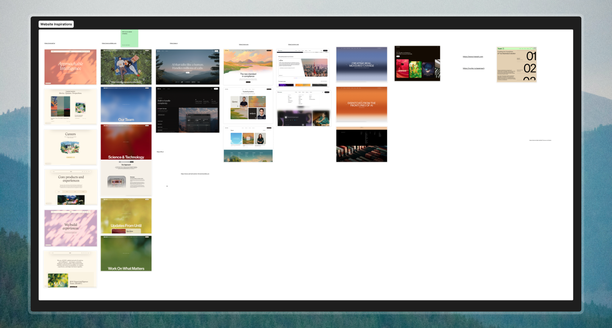
The Research
Understanding what enterprise AI companies do right.
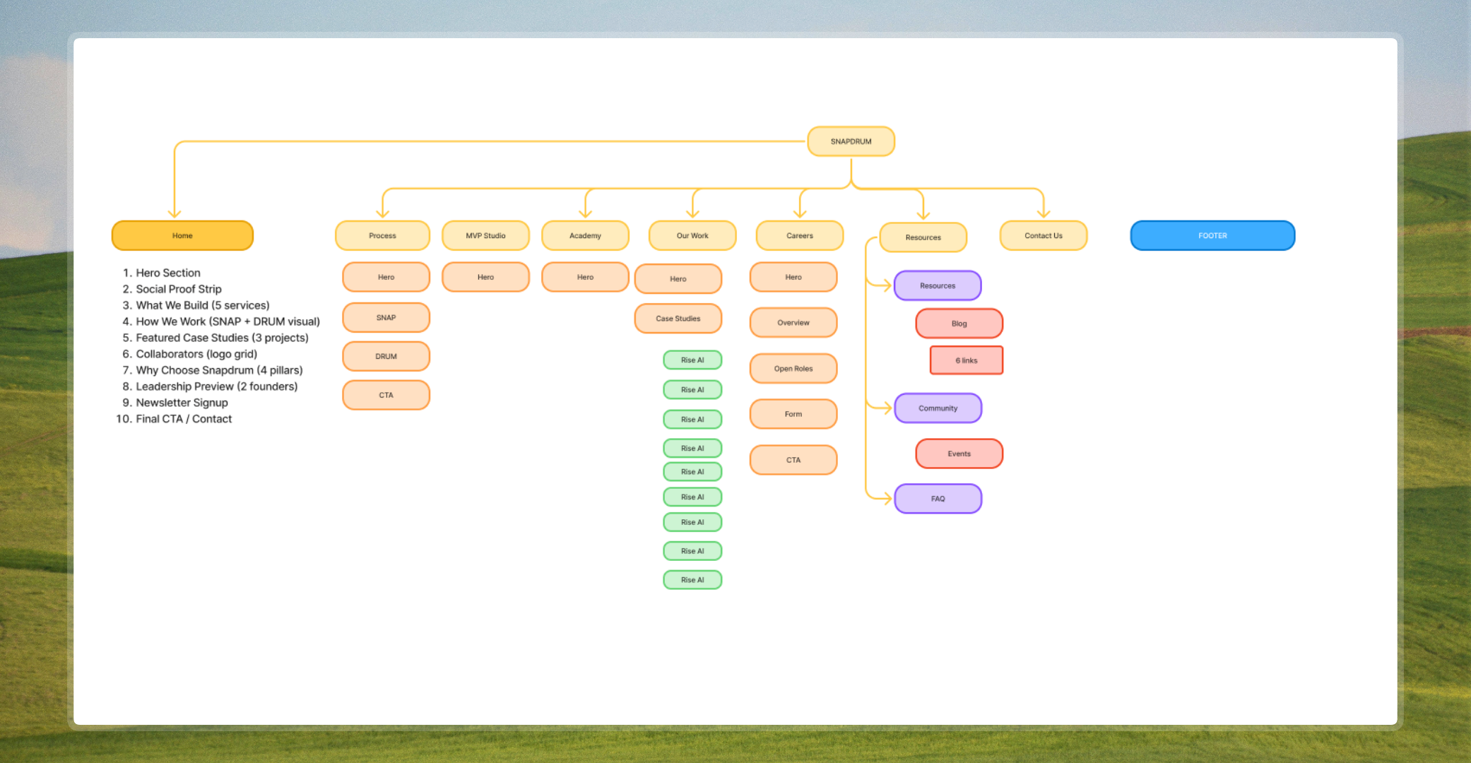
A competitive analysis of Microsoft AI, Giga, Duna, and Cohere revealed clear patterns in how market leaders communicate value. The existing Snapdrum sitemap was overcrowded, with too many pages competing for attention. The research pointed to one direction: simplify, sharpen, and lead with outcome over feature.
Microsoft AI
Balance technical depth with emotional resonance. Lead with humanity, not just capability.
Giga
Lead with concrete capability, then back it with scale. Specificity builds confidence.
Duna
Position as the future standard. Buyers want to feel like they are ahead, not catching up.
Cohere
Bridge technology and business outcome. Enterprise buyers need to see ROI, not just features.
The Design
Simple, enterprise, and built to current standards.
The design direction was clear from the research: strip back the noise, establish visual hierarchy, and build every component to feel intentional. Every section was redesigned from scratch with modern interaction patterns, smooth transitions, and enterprise-grade polish.
01
Navigation
Replaced the flat header with a glassmorphism nav that adapts on scroll, giving the site a modern, layered feel without losing clarity.
02
Hero
Rebuilt from the ground up with motion and purposeful hierarchy. The hero now leads with the value proposition and draws users in with animation.
03
Interactions
Added smooth transitions, hover states, and scroll-triggered animations throughout to make the experience feel alive and responsive.
04
Footer
Redesigned to close the experience with structure and trust signals, consistent with the enterprise tone set across the rest of the site.

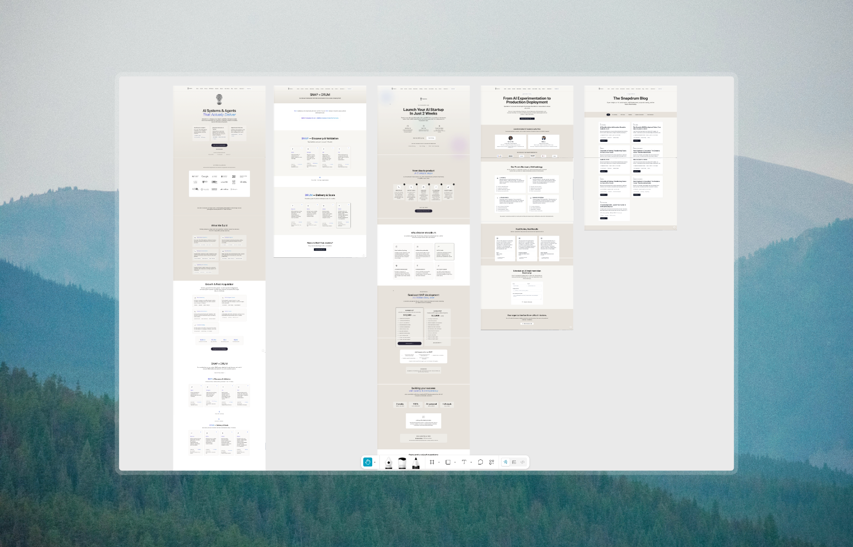
The Solutions
Three core solutions, applied across the entire site.
Solution #1
Introduced motion and interactivity to bring the site to life.
The static feel was replaced with purposeful animation, scroll-triggered transitions, hover states, and a glassmorphism navigation that adapts as users move through the page. Some examples of where this came through:

Solution #2
Built an enterprise visual system that earns trust immediately.
A cohesive design language was established across every component, from the hero down to the footer. Clean typography, intentional spacing, and visual credibility signals replaced the generic aesthetic of the old site. Some examples:

Solution #3
Reorganised the information architecture for clarity and conversion.
The overcrowded sitemap was simplified and restructured so visitors could navigate with confidence. Content was prioritised by what enterprise buyers actually need to see, reducing friction from first visit to contact. Some examples:
Reflections
What I'd do differently next time.
This project pushed me to think beyond individual screens and consider how design decisions compound across an entire site. Rebuilding every section from scratch taught me the value of working systematically rather than component by component in isolation.
01
Build components in Storybook
Midway through development I realised how much time I lost rebuilding similar UI patterns. Next time I would develop every component in Storybook first, creating a reusable library I can draw from across projects.
02
Establish a design system earlier
Starting with a defined token system for spacing, typography, and colour would have made iteration much faster. Decisions made late in the process required more rework than they should have.
03
Validate interactions with real users sooner
The animations and transitions felt right to me, but I would have benefited from testing them with actual enterprise users earlier to confirm they add clarity rather than distraction.
04
Plan performance alongside design
Adding motion and GIFs late in the process meant performance was an afterthought. I would approach animation and asset optimisation as a core part of the design process from the start.
Live Site
snapdrum.com
See the full redesign live. Every animation, interaction, and component built to enterprise standard.
Visit snapdrum.com